 |
| Signal GH 3.0 Circle Graphs |
Finding myself out of work in the Fall of 2021, I took to updating my skill set, which meant immersion in SwiftUI. I had done some SwiftUI work at my day job at IBM writing Pilotbrief, and my son and I had written the watch version of TV Towers USA in SwiftUI, but I needed to up my game. And what better venue than my signal meter app for the HDHomeRun: Signal GH originally published in 2008, yes the first year of the App Store.
 |
| Signal GH 1.x (2013) |
 |
| Signal GH 2.x (2016) |
 |
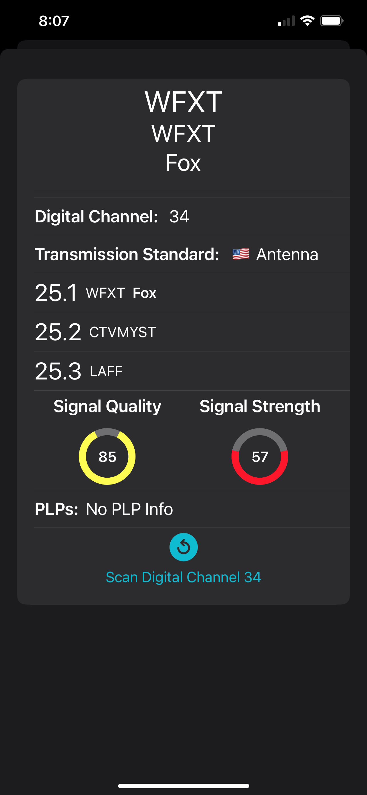
| Signal GH 3.0 (2022) |
The UI has been completely refreshed, except the map which wouldn't have benefitted from a SwiftUI replacement, with an emphasis on showing both graphs and meters simultaneously. And while I always loved the spinning wheel picker to choose the channel, one must admit it took up a disproportionately huge amount of screen space. Replacing it with a menu button was a huge win for showing more data and less chrome. Just tap on the digital channel number.
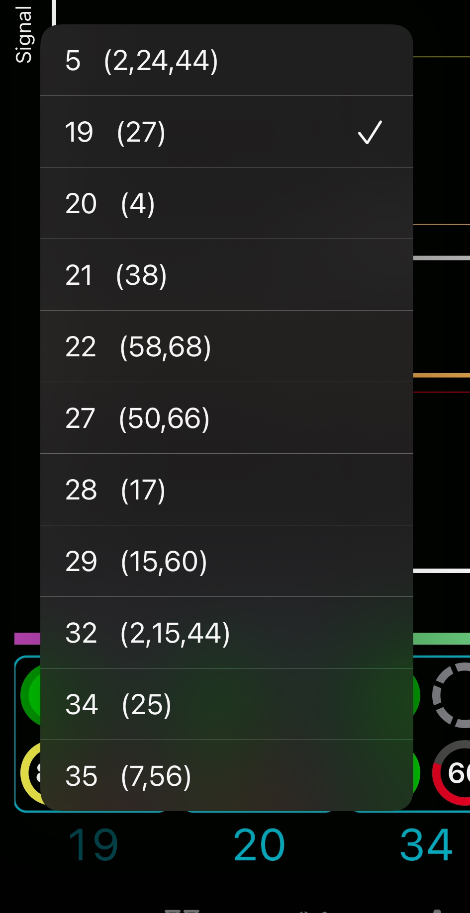 |
| Menu of Digital Channels |
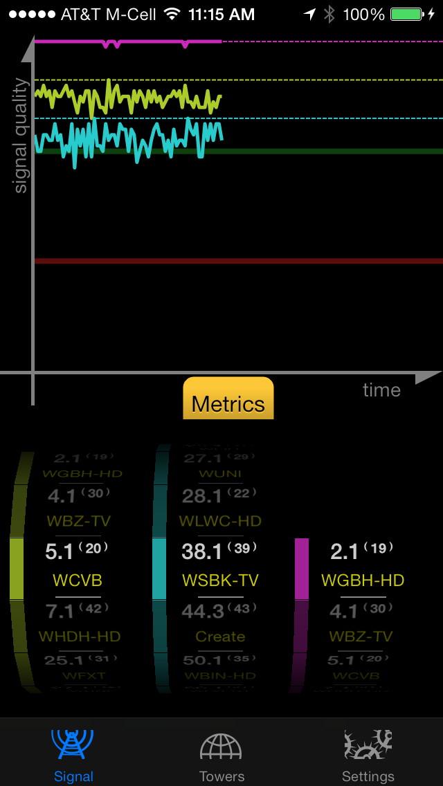
Version 2 had featured wide bar graphs indicating signal quality and signal strength.
 |
| Signal GH 2.x's Bar Graphs |
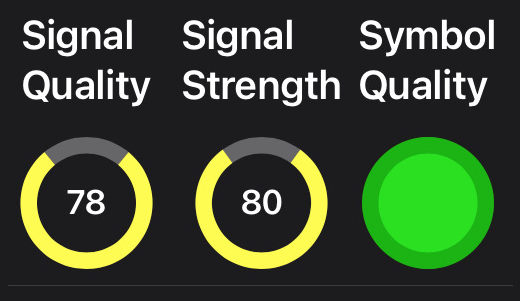
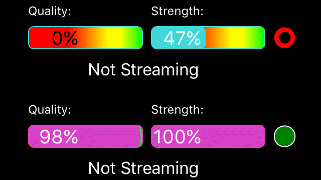
I always loved these bar graphs with their gradient backgrounds and individual colors. And patted myself on the back about how the numbers transitioned from white to black as the bar slid under them But they were bulky. I replaced them with the compact circular graphs, similar to the ones I see on the Apple Watch.
Signal GH 3.0's Meters
They are animated and colorful, and most of all take up minimal space.
Both of these compacting moves lost instant discoverability. The old spinner was big, but at least, most people would recognize it as a channel selection control. The old bar graphs were wide, but at least there was plenty of room for labels. Now, users will have to learn that the bottom left circular graph is the signal quality indicator, and the bottom right is signal strength. Tapping on the meters brings up a summary view and that view has labels, so I hope most of them figure it out.
 |
| The Tuner Detail Sheet |
I rely heavily on the new action color—the sort of turquoise blue you see throughout these screenshots—being recognized as tappable.
To try to help with discoverability, in a first for one of my apps, I included several pages of documentation under the info tab: written in SwiftUI, so it has tappable elements. Tapping on the channel menu button in the documentation actually brings up a channel selection menu. There are no screenshots.
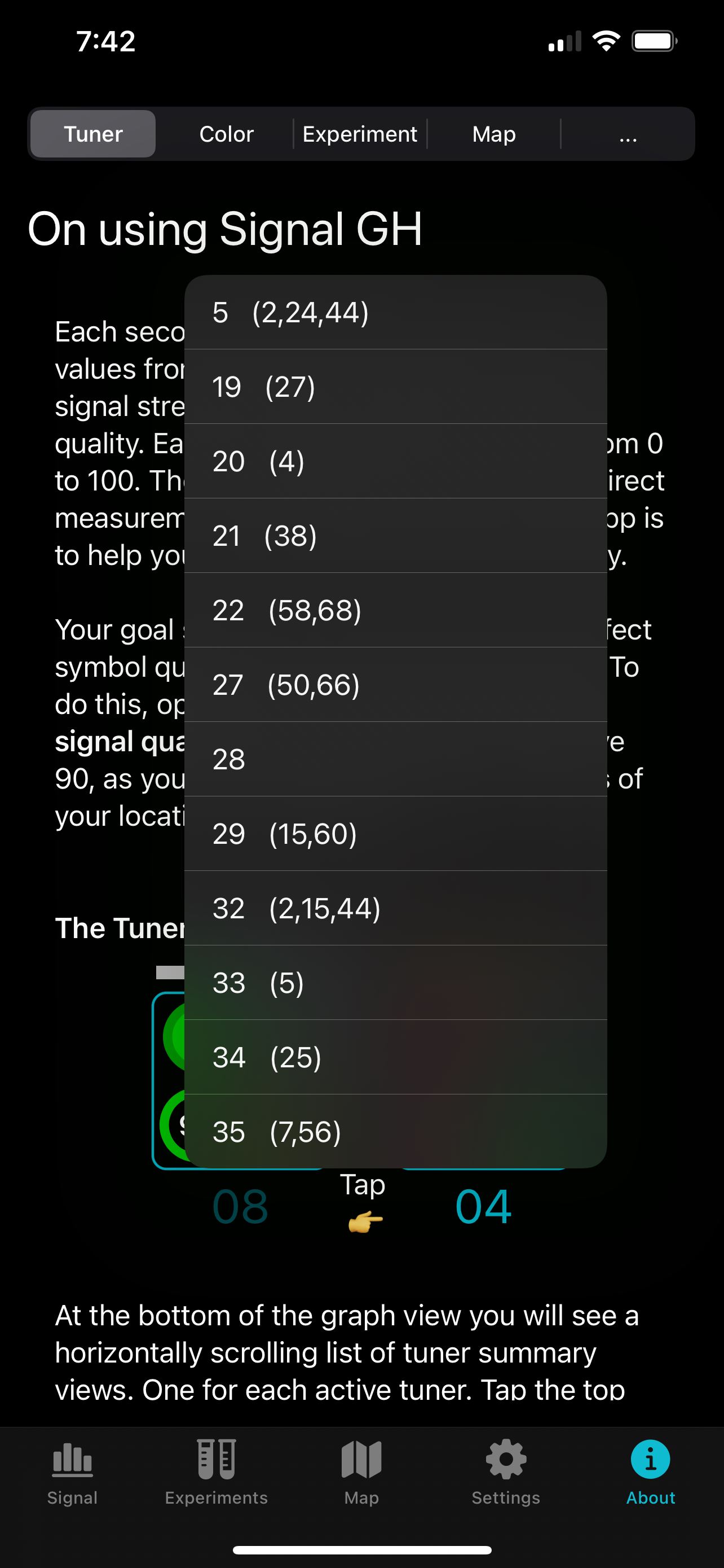 |
| Live Tappable Documentation |
 |
| When I Update Colors, The SwiftUI Documentation Updates |
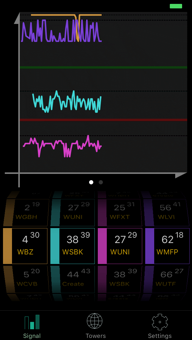
I always wanted a bit of flair on the line graph, so the new one has an animated pulse circle that briefly appears when a new data point is added.
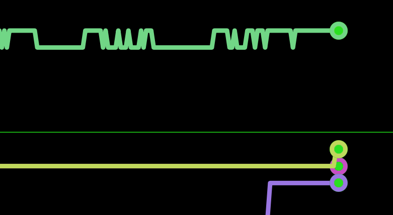 |
| Pulsing Circle on Graph |
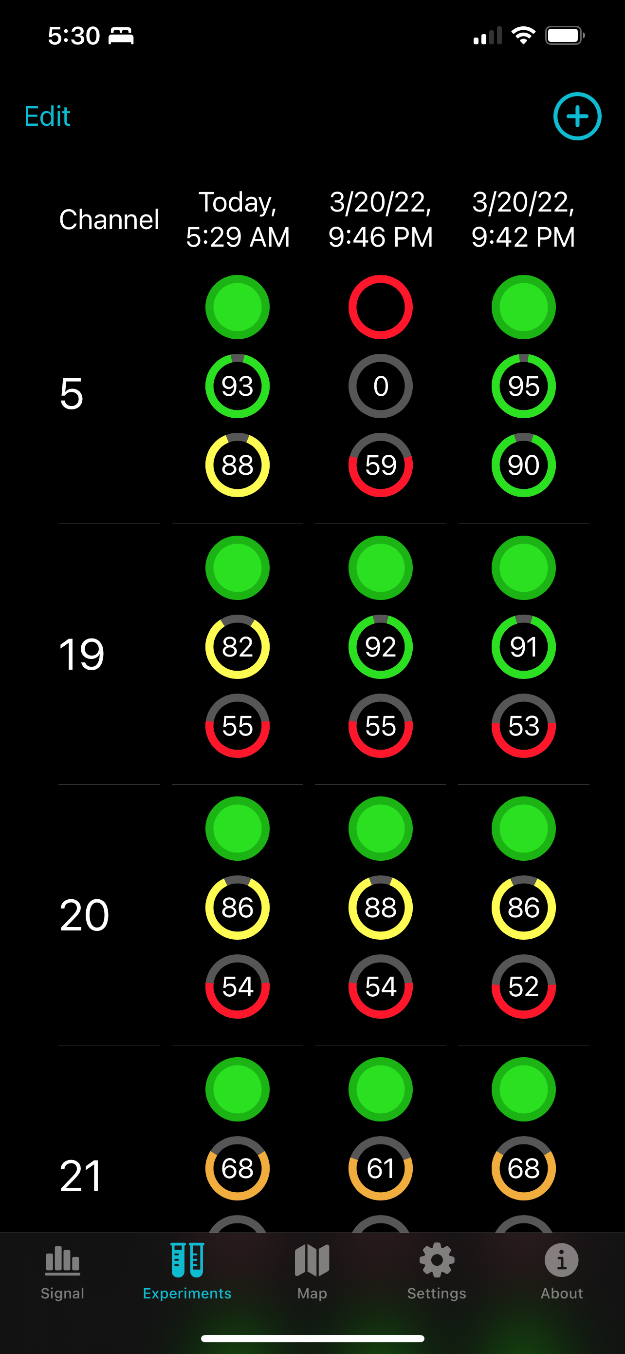
Experiments Tab
Ran into a bit of a bug in SwiftUI here; the table wouldn't align to the left when there's only a few entries. And—I hope it's not making your eyes bleed—the need to use customary hazard colors made this tab garish. I've been thinking of putting out a Mac version, and this and its export function seem like an excellent Mac feature.
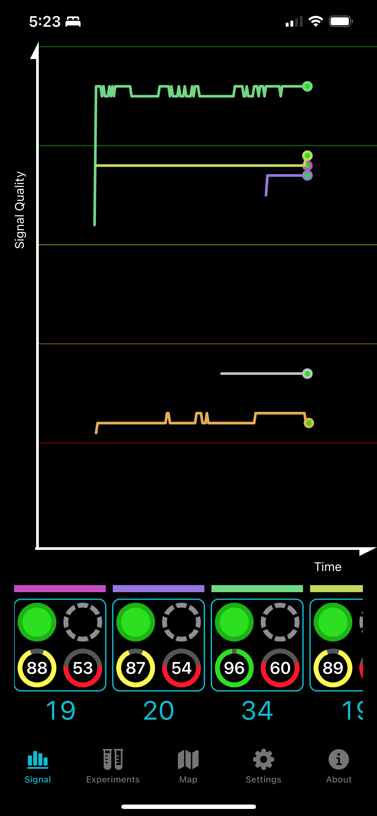
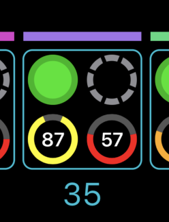
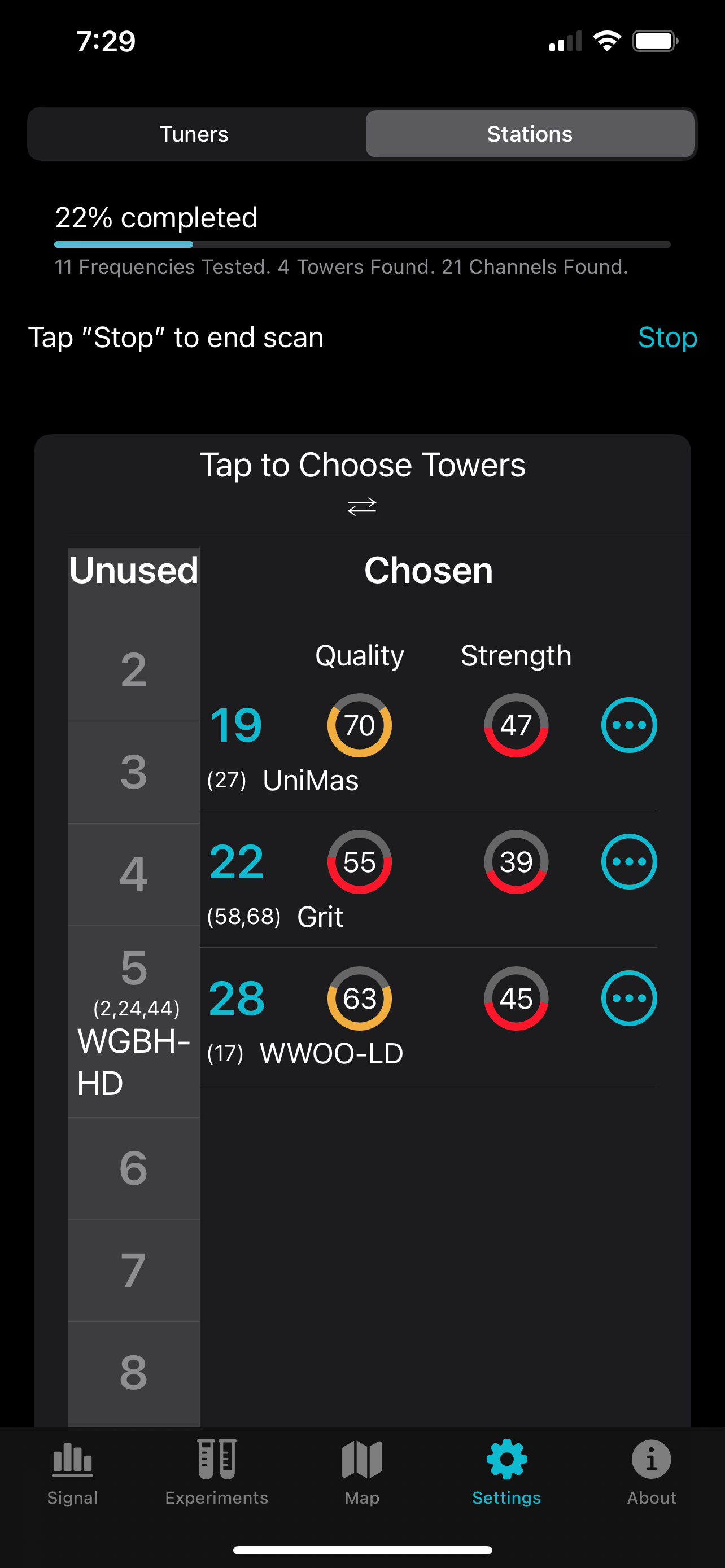
The onboarding/settings views were an incredible amount of work to get where I wanted them. I had not liked the previous iteration. Particularly, the need for separate tabs to manually choose or automatically scan digital channels. And the previous progress was awkward and not descriptive. I ended up with a tall column of available digital channels which you could choose to manually add and scan. Or you could scan the entire ATSC range, or you could press a location button and I could add nearby towers from my database. The progress view is a massive improvement, much more descriptive about what's going on. This is tight on a 7th generation iPod touch, the smallest device that runs iOS 15, but it fits except the the labels above the Quality and Strength graphs which are truncated. And you can tell at a glance which channels are already reasonably optimized.
 |
| Settings/Onboarding |
I took the opportunity to rewrite all the HDHomerun interface code in pure async/await Swift. The new actor type was of particular help wrapping the hdhomerunlib which is written in C and is particular about multiple threads trying to interface with the same tuner struct. Scanning multiple tuners simultaneously was pretty simple with an AsyncSequence. Should be extremely reliable.
The ... button in the app brings up a channel summary sheet with live signal meters and I even display the program data from the tuner's data stream. Unfortunately, we don't have a NextGenTV ATSC 3.0 broadcaster here in southern New Hampshire, so I've gingerly added support for displaying and selecting ATSC 3.0 PLPs (the individual programs embedded in the data stream) with some help from beta testers, but they are still not working right, and is the main reason I haven't submitted it yet.
 |
| Channel Summary View with Live Meters |
The new icon—being by me—was typed by hand in SVG using BBEdit. I wanted to emphasize new elements to the app, so there's the circular graph, the pulsing line, dark mode, a new orange level of quality between yellow and red, all while retaining the idea of an old fashioned wire antenna wrapping a graph. It was a struggle keeping it from being overly garish. A hard thing to do for an app that communicates so much with color. In particular, the yellow of the line was the tuner color that pops the best on a dark background when the icon is small, the magenta I'd initially tried was much too muddy at tiny size.
 |
| Signal GH 3.0's New Icon |
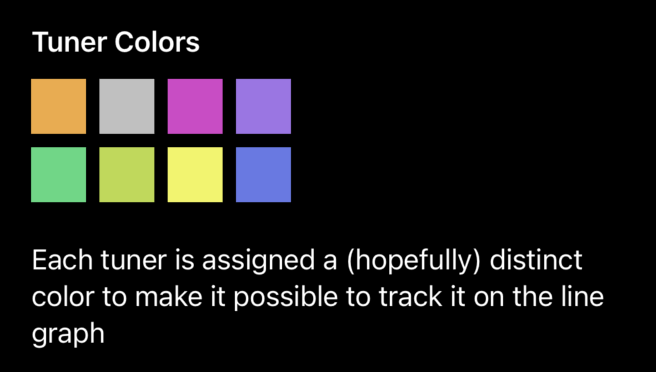
Actually, it's only an approximation as the yellow in the app is in the P3 space (yay modern displays) and really pops there where I can only use RGB hex in my SVG. Colors in general, got a refresh. I use different colors for each tuner, and it is hard picking out distinctive colors that look good in both dark and light mode, so I used XCAsset colors to define both light and dark variants. Choosing tuner colors reminds me of back in the day when I was writing karyotyping software and the biochemists needed dyes to stain every human chromosome a different color. You run out of distinct colors pretty fast.
All the other static artwork—except for the map tab, and my app icons in the info tab—are standard SF Symbols. Yes, I'm not using hand crafted SVGs anymore. Which was great, flexible and highly recommended, although the only appropriate icon for the Experiments tab is the sort of lame test tubes.
It was a great learning experience revamping this venerable old app, I just hope my users can accept a little change.