The Parental Gate
Apple rejected my app three times. The first was because of sloppy layout issues on my part, but the last two were because of the Parental Gate. Basically, apps in the kids section have to ask for parental permission every time the kid wants to buy something or interact with the wider Internet. I somehow missed this, so the second rejection was because I'd missed this requirement. So, no gate on purchasing my beautiful stickers, and no gate on sending artwork via e-mail; bam another 5 days in the review queue.
So I looked around at what that actually meant, and found these examples at Dreambot Studios. Amazingly, Apple didn't provide a standard API for providing a secure gate. I'd have expected there would have been an API that provided a localized challenge string, and a cryptographically secure method of validating a response. Instead, developers have to roll there own method to differentiate between a 12 year old and an adult. I chose a math problem I didn't think my precocious 8 year old could solve:
 |
| Frog Draw's Parental Gate . |
Apple provides a mercifully short set of guidelines for iOS app submissions and here is the entire relevant guideline for the need for a parental gate:
24.3 Apps primarily intended for use by kids under 13 must get parental permission or use a parental gate before allowing the user to link out of the app or engage in commerceSo given this directive, I thought it would be easiest on the parent to provide a convenient one stop location for all the parental controls, so that the parent could allow or disallow purchases, allow for making a quick trip to the App Store to rate the app, and turn on various means of sharing the drawings. All of these were off by default.
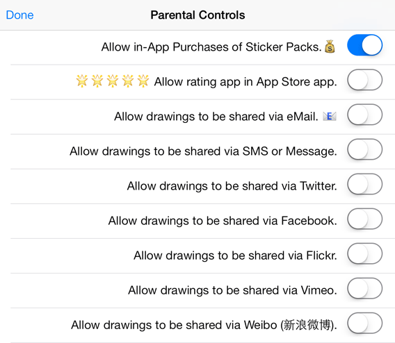 |
| My Rejected Parental Controls Pane |
I was pretty upset about this, but I kept calm and appealed the ruling to the review board, and was promptly told my appeal was rejected; this was indeed how the review team interprets rule 24.3. Two things, one I don't like arbitrary rules ruining my beautiful app with user hostile behaviors; I want to empower my users to have fun and draw some silly images. And two, as a parent, I am not feeling empowered. As a parent, I would likely want to disallow in-App purchases even though Frog Draw only sells non-consumable clipart/stickers—I still remember spending $35 on Smurfberries—and allow e-mails. I don't care either way about rating the app. And turn off everything else. But it's Apple's playground, so I did it their way.
Can Kids Apps be non-Skeuomorphic?
As an adult with something approaching design taste, I am happy with iOS 7's lack of chrome and general removal of fake analog reality. I wish buttons had just a little bit of chrome, but otherwise, I'm a happy iOS user. But do children need something more? I guess I'll find out.
Here's my iPhone layout while displaying its color toolbox:
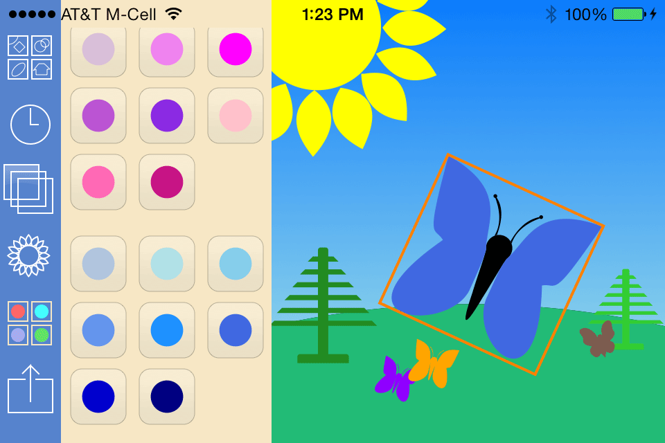 |
| Frog Draw with Color Buttons |
You'll notice that I am using recognizable buttons, but with light chrome. Also that the artwork projects into the status bar; this is under the user's control. Want to see what time it is? Draw something light under the clock. I'm using a light highlighting to show which tab is active, and in general I'm following the rule that controls should not be visually distracting. The important part should be the art.
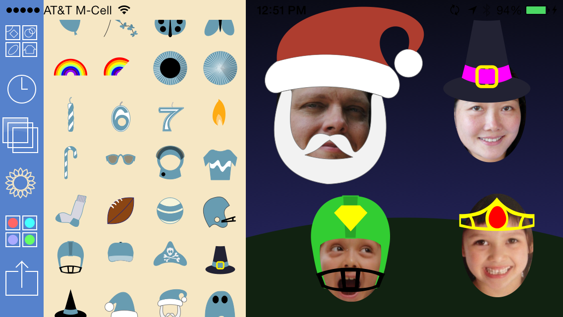 |
| Frog Draw with Stickers |
I hope this applies to kids too, and they don't require Fisher-Price controls and fuzzy bunny cartoons wasting space and distracting them; or more importantly for downloads that parents don't have a pre-existing view of what kids apps look like.
In my first version of this interface, I thought it would be cool to have iOS 7 style squircles behind my shapes. But testing with my kids revealed that children are already hard coded to tap on that shape (instead of what I want them to do, drag a copy off). So I removed the squircles which led me to change the color of my toolbox, which led me to change the color of my toolbox tab bar, which lead me to change my highlighting color which led to my final design, which I love.
The design choice I made which I'm most unsure of is the icon. On the one hand, modern iOS icons are geometrically simple, clean lined, abstract pieces of art. On the other hand it's hard to make a happy smiling abstract frog, it'll look too much like a duck. If my app doesn't sell, I'll blame the icon.
[Update: I've changed my mind on the icon. I'll dial back the cold inaccessible look and add some humanity to the 1.1 version's icon.
]
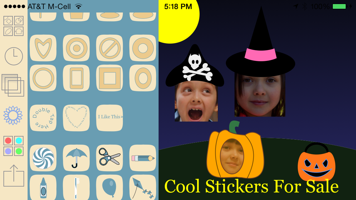 |
| An Early Design that had Issues. I missed Halloween. |
The design choice I made which I'm most unsure of is the icon. On the one hand, modern iOS icons are geometrically simple, clean lined, abstract pieces of art. On the other hand it's hard to make a happy smiling abstract frog, it'll look too much like a duck. If my app doesn't sell, I'll blame the icon.
[Update: I've changed my mind on the icon. I'll dial back the cold inaccessible look and add some humanity to the 1.1 version's icon.
]
Kids and Gestures
I've already covered the importance of gestures in a modern interface but a few words about kids. Kids are more adept than we old folks at picking up gestures. They get the visual cues, they know what worked in other apps and they don't have a lifetime of mousing to unlearn. In fact, my daughter asked me the other day, "what is a mouse?" when she was trying to figure out a Flash game on PBSKids (we use Magic Trackpads with our Macs). Kids pick up gestures if you give them enough clues or a visual explanation of what will happen when you do what. My major concern is communication with the user about the non-discoverable gestures like my 2 finger up down swipe to change the order of shapes. Thus, the importance of having a decent on boarding screen for the first time the app gets run. As I have the ability to animate the whole creation process of a Frog Draw document, my on boarding window has an animation of some gestures, and I hope this is enough, but I'll likely revisit this.
Make a Quality App
There is nothing about writing for kids that means you can cut corners. My son knows what a good app looks like and how it acts. Last night, he was making sure I knew I should have a longer tutorial/level up section just like his best games have. At release of 1.0, I have a good app. I've profiled it to look for speed bottlenecks, I've rejected my own submissions to Apple more times than I'd like to count when something came up which would result in a child having a bad experience. The last month of development has humbled, but I think the end product is worthy.
I don't know if people value this, but I do. The packaged up App is only 4MB. It would have been under 3MB, but at the last minute I had to add 64-bit support or Apple's face recognition functions wouldn't have worked on A7 based iOS devices. This was all possible because pretty much every pixel in the interface is drawn either in code or by rendering lightweight SVG, and not with bulky bitmap images. I hope potential customers don't see the small download size and think there's something missing, I value efficient use of a user's limited space. Being bulky will get an app booted off my iPad if I don't use it daily.
Frog Draw 1.0 Free in the App Store, no Ads, no consumable in-app purchases, just some child-friendly vector clip art. Thanks. [Update: now the app is $.99 and there are no in-app purchases. I'm trying different ways to make money. Still no ads.]